Smart Menu Design and Strategy
Cafe
1 min read
Your menu is one of the key marketing and revenue drivers in your business and as such a great deal of thought needs to go into its design, both in terms of the items you wish to serve, pricing and the actual design and layout of your menu, cards boards and screens.
The Market – The success of your menu is rooted in your knowledge of your market. Think carefully about the following and build your offering accordingly:
- Who are your customers? What is their demographic profile, how much do they spend, what do they like to eat, and just as importantly, what don’t they like to eat?
- Stay focused on your target market and develop your menu and pricing to best suit their needs. Avoid trying to be everything to everyone as this will dilute your offering and increase your operational challenges.
- Who is your competition? Get to know their offering and their pricing, which in turn may give you some valuable insights into your target market. That said, don’t be lead too much by your competition, run your own race but use your competition to help you stay in touch with the market.
- Are kids likely to be a driver in people’s decisions to dine with you? If so, consider designing some of your menu items to be attractive to kids.


- Parallel to this, avoid stacking your prices in a column, this will help avoid customers making their selection based on price.
- When displaying price on your menu, avoid using the ‘$’ sign. This will draw customers’ attention to the price rather than the description – emotion over reason.
- It’s also recommended that the cent component of your price is displayed in a smaller font than your dollar amount as per the examples below.

Your menu is a strategic communication device so design and layout are critical.
- Customers only invest between 60-90 seconds to read a menu. Your layout, therefore, needs to be simple, logical, and easy to follow.
- Avoid giving your customers too many options; less than seven items per category is ideal
- If you need to add more options, consider adding more categories. Instead of 12 entrees, perhaps have six ‘entrees’ and six ‘small dishes’.
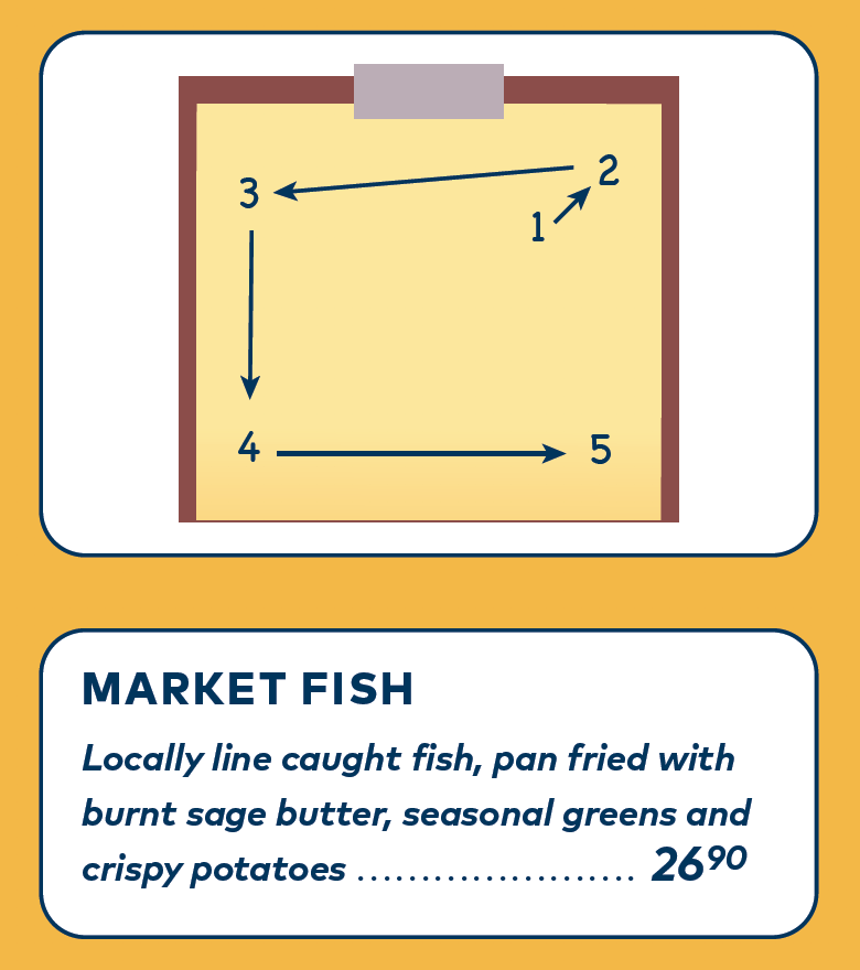
- Studies have shown that when reading a menu, particularly a menu screen or board, peoples’ eyes normally start near the top right-hand corner of a menu board or screen. Their eyes then typically track in an anticlockwise direction, as shown on the left.
- Ensure that your menu reflects your brand and that you’re using the same brand elements consistently throughout every customer touchpoint. If you’re using a menu screen or board, make sure that it’s easy to see from where the customer will be standing.
- It’s recommended, particularly in a café or fast-paced short order restaurant, to supplement a menu board or screen with smaller menu cards so that customers can digest the menu in their preferred format.
- Photos of the dishes are ok on menu boards and screens in some environments, if designed correctly; however the quality of the photography must be professional and first-class.
- Make sure that the focus of each menu item is the name of the item and its description, rather than the price, as per the example above right. Let people buy with emotion, and then use that to justify the price.
Pricing and Strategy – When thinking about price, your goal should be to sell to the greatest number of items to the greatest number of people at the highest possible price.
- Make sure you know your food costs. This is critical for a variety of reasons, the main one being that your selling price should be four times higher than your food costs. This is known as bottom-up pricing.
- You also need to think about top-down pricing; ‘what is my market prepared to pay for this?’ Hopefully, the top-down and bottom-up pricing should be equal. If they’re not, do not drop your price below the four times multiplier; if customers simply aren’t prepared to pay for this, then you’ll need to find ways of increasing the perception of value and/or refining your food costs.
- Avoid the temptation of having an item on your menu which sits below this four times multiplier thinking that the other menu items will carry it.
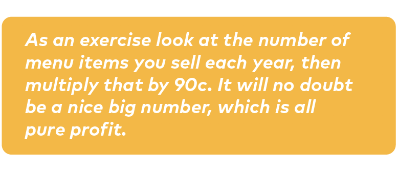
- Human nature is such that consumers typically don’t pay attention to the cents in the price; they focus on the dollar. For this reason, you’re leaving profit on the table by not adding 90c on to each item on your menu.

- Consider the pricing of each item in the context of the other items on your menu. One handy trick, especially if you’re offering a small and large option of the same item, is to set your smaller item’s price quite high, relative to the larger item. For example, if a small fish and chips is $19 and the large is $22, the majority of customers will buy the larger one as it seems like much better value for just a few dollars more.
- Make sure you have a good range of logical and affordable add-ons with a good margin attached. This is a great way of increasing your ticket price and helping maximise your CTT ratio.
